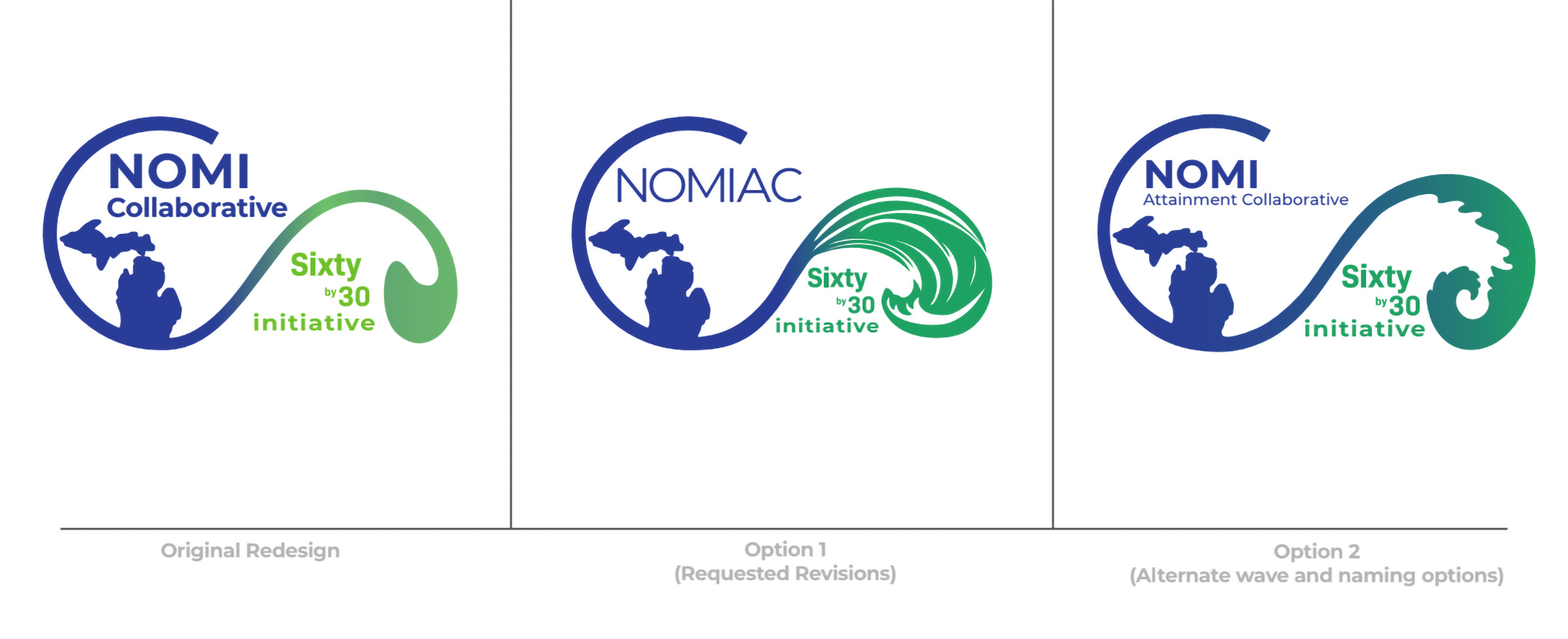
NOMIAC needed a new identity that could represent a broader collaborative without losing the recognition already tied to one of its existing initiatives.
The NoMI Attainment Collaborative was formed by bringing several Northern Michigan education initiatives together under one umbrella. One of those initiatives, Sixty by 30, already had an established identity.
That meant the new mark could not start from nowhere. It needed to feel connected enough to what already existed, but broad enough to represent a larger collaborative with a wider mission.
This was a professional engagement through NMC’s Extended Educational Services, with multiple stakeholders, review rounds, and real implementation needs built into the process from the beginning.
The challenge was not coming up with ideas. It was getting several meaningful requirements to work together without the mark collapsing under them.
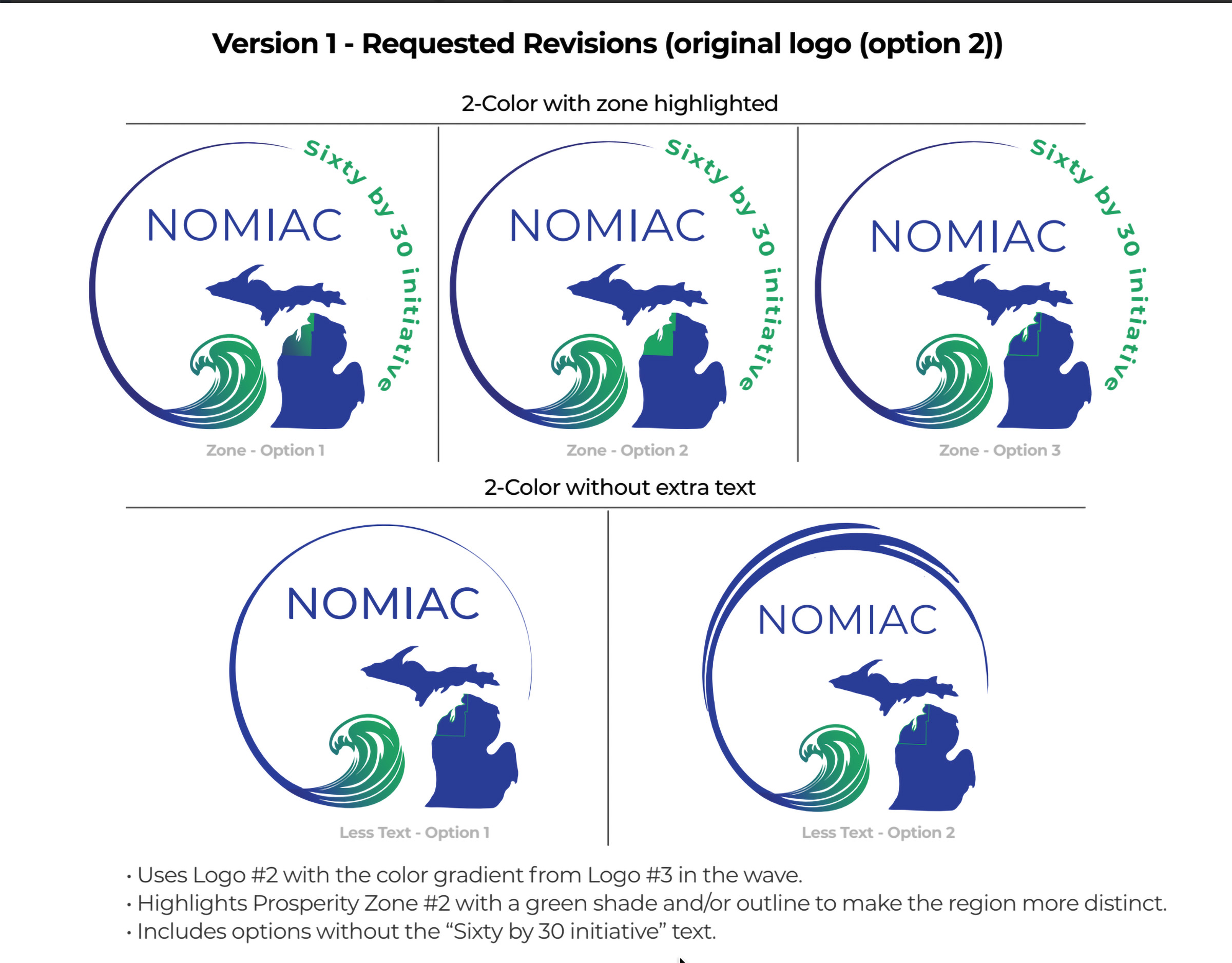
Before I started designing, I asked Amy a detailed set of questions about the brand guidelines I needed to follow, the elements they wanted included, the audiences they were trying to reach, where the logo would appear most often, the formats they needed, and how many variations the final system should include.
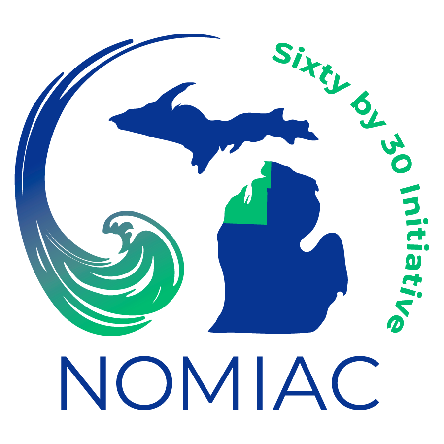
That context shaped everything. The client wanted the Great Lakes wave, the Northern Michigan Prosperity Zone inside the mitten shape, a brand gradient, and the Sixty by 30 name integrated into the mark. Each of those elements mattered on its own. The actual design problem was getting all of them to work together in a way that still felt clear, clean, and usable at small sizes.
The color decisions were tied to things that already mattered to the organization. The blue came from the existing Sixty by 30 identity, and the green connected back to one of NMC’s own brand colors. That helped the final system feel new, but still grounded in what was already recognizable.


The final system moved beyond approval and into real use.
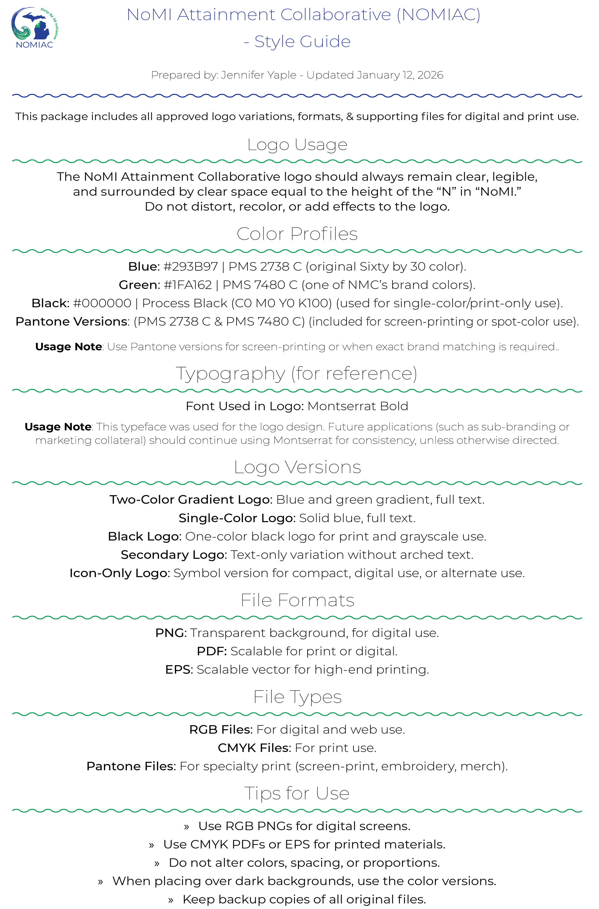
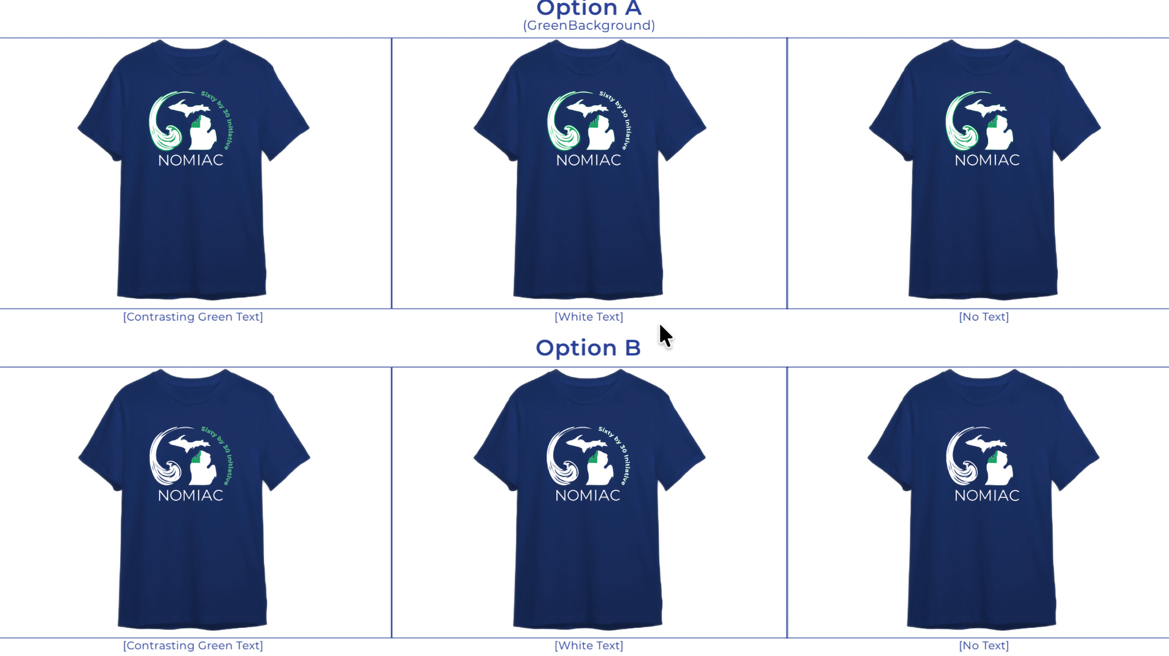
The final logo system was approved and packaged for use across print and digital formats. Not long after, they reached back out for apparel-ready versions as the identity moved into broader use.
That follow-up work meant preparing files for screen printing and embroidery at specific dimensions, along with repackaging the logo suite to match those production needs.
The final deliverables included a logo system, a style sheet, and organized file packages prepared for the ways the identity would actually be used.