Make one statistic impossible to ignore.
The statistic that stayed with me was this: 40–60% of people experiencing homelessness are employed.
Each year, NMC's Visual Communications program partners with National Hunger and Homelessness Awareness Week. Every student is assigned a designer to research and then use as design inspiration. Mine was Paula Scher.
While I was researching homelessness, that one statistic stuck with me because of how it challenged one of the most common assumptions people make. Homelessness is often framed as a distance, as though it belongs to some separate category of people. It doesn’t. For many, the gap is much smaller and much more precarious than people want to believe.
I’ve felt a version of that pressure myself. The fear of doing what you’re supposed to do and still not being able to afford stability. That feeling is what the work is built from.
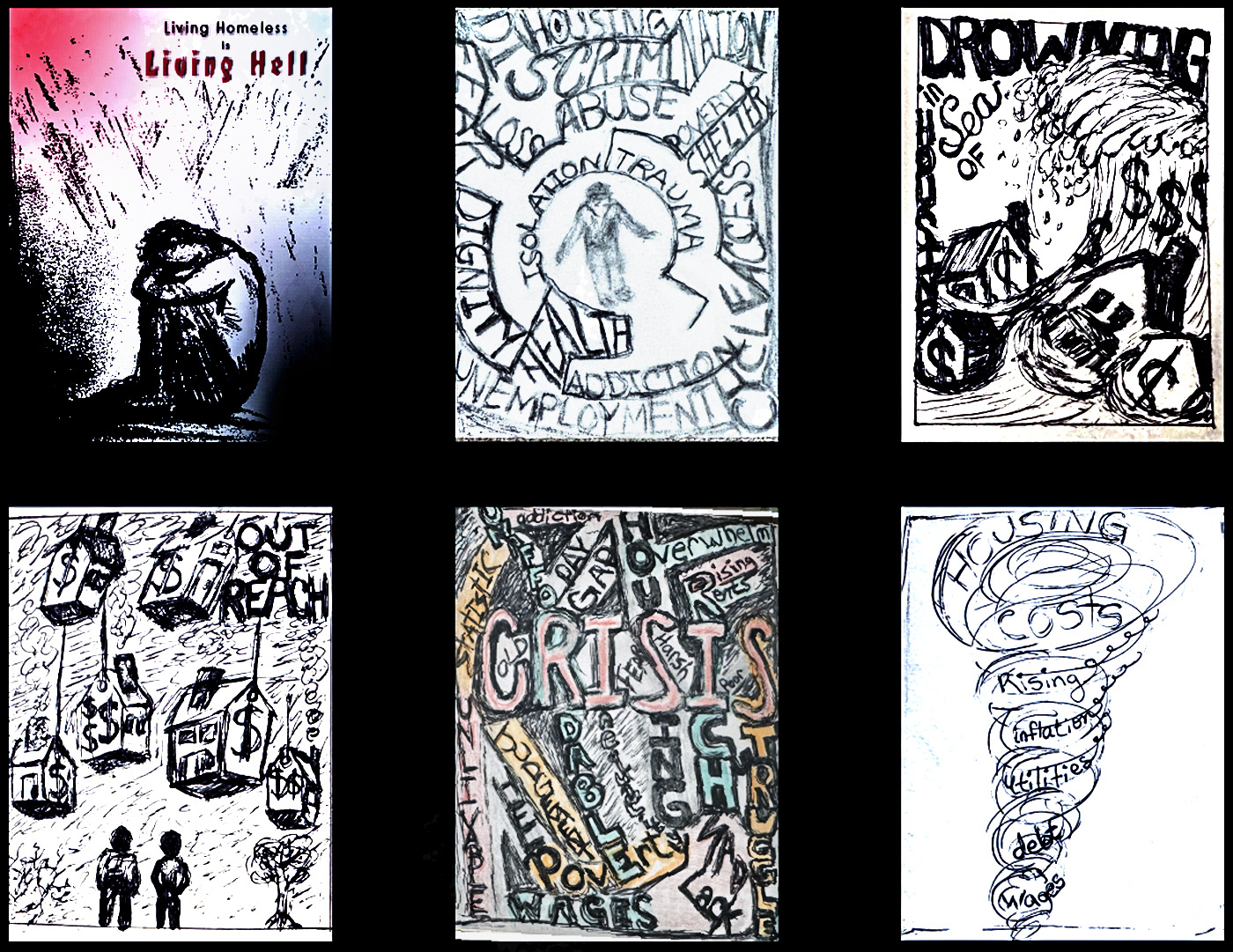
The concept came quickly. Making it work took longer.
The idea was clear early on. The challenge was building it into something that could hold the weight of the message.
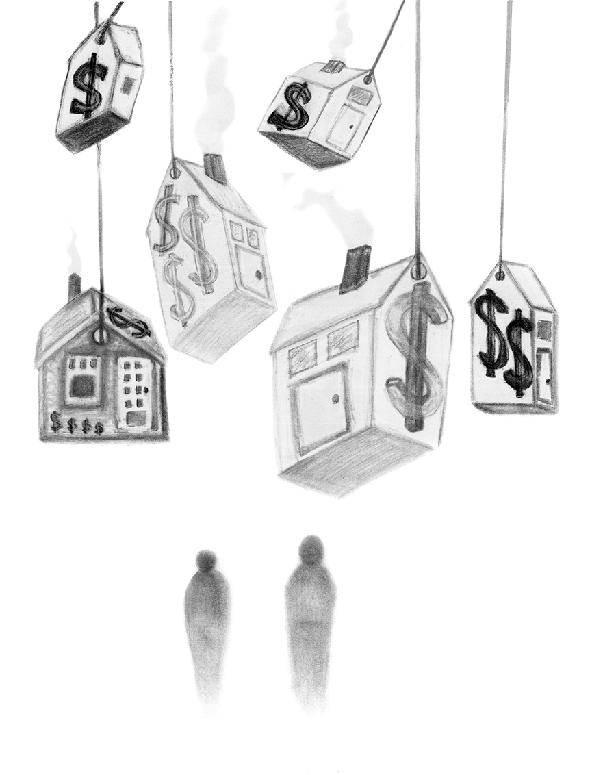
I sketched through several directions, trying to find the right relationship between image and type. I wanted the design to put you in the feeling first, not explain it.
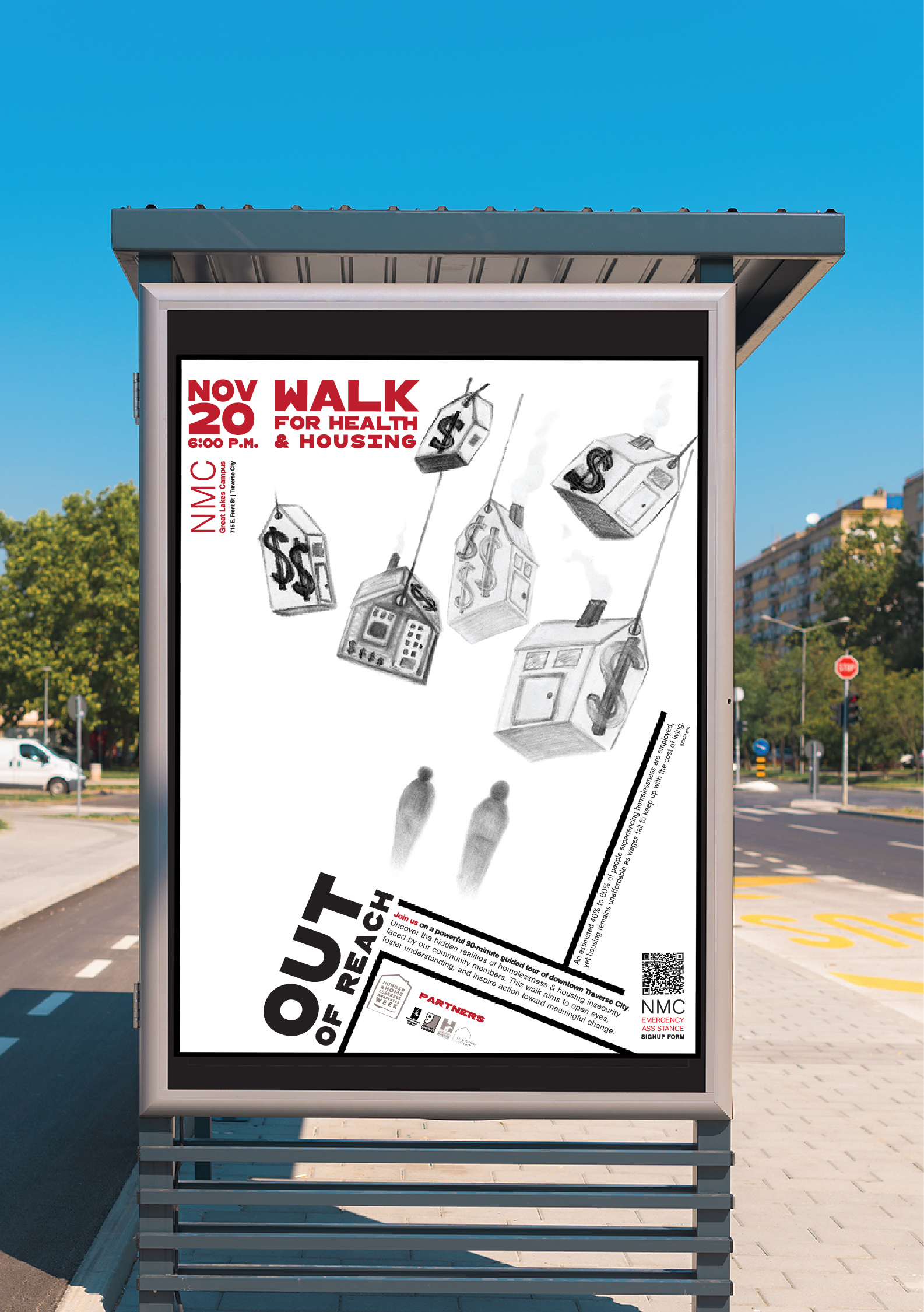
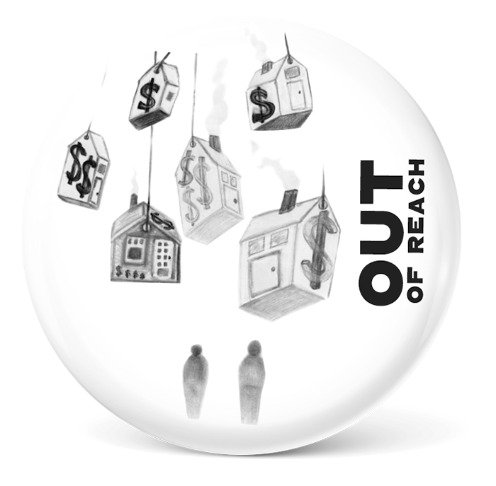
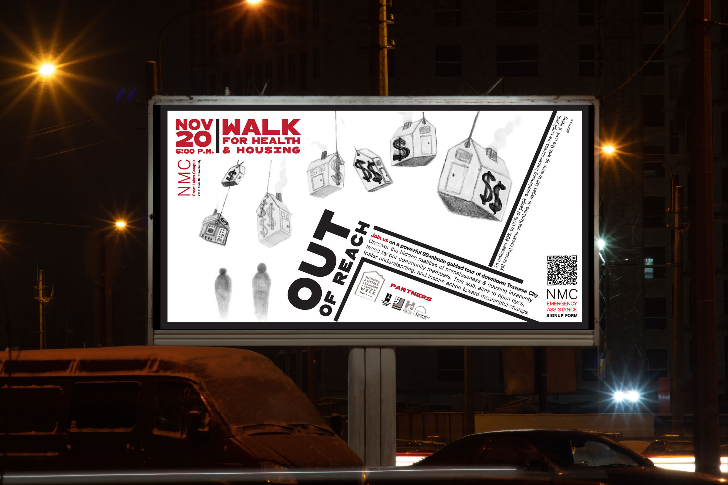
I focused on the gap between income and housing, using price-tag-shaped
houses to make “Out of Reach” immediately understood.
Paula Scher’s influence shows up most clearly in the typography. The type is not sitting on top of the image as an explanation. It is part of the structure. The image and the type are doing the same job. Remove one, and it stops working.
The work moved beyond the classroom.
What started as a class assignment became the official advertising used for the Hunger and Homelessness Awareness Week campaign.
The final design ran in print, on campus screens, on local news television, and on a digital billboard at Great Lakes Maritime Academy, where the Walk for Health & Housing began. Buttons were also distributed at the event.
The project was later recognized with an ADDY Award through the American Advertising Federation. What mattered most to me, though, was that the work did what it needed to do. It made people stop. It made the issue harder to simplify. It made one truth visible in a way that could be felt before it was fully read.