Turn a physical color system into something interactive without losing how it works.
My instructor owned a physical copy of Itten’s Color Star and asked whether anyone could turn it into a working interactive application. I decided to take it on.
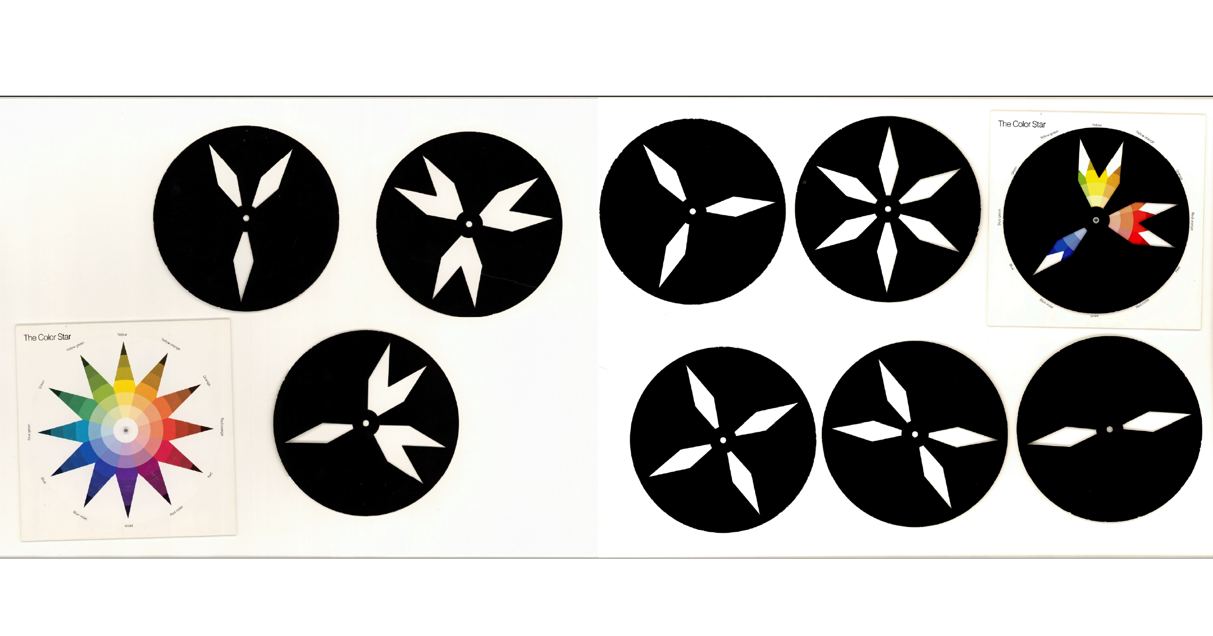
The Color Star, first published in 1921, combines a 12-point color wheel with a set of rotating stencil-like discs, each designed to reveal a different color relationship. You place a disc over the wheel, rotate it, and the harmony changes with it.
What interested me was that it was both precise and physical. It wasn’t just a color reference. It was built around interaction.
The challenge was accuracy. Every disc and every rotation had to line up correctly. If the alignment was off, the tool stopped doing its job.
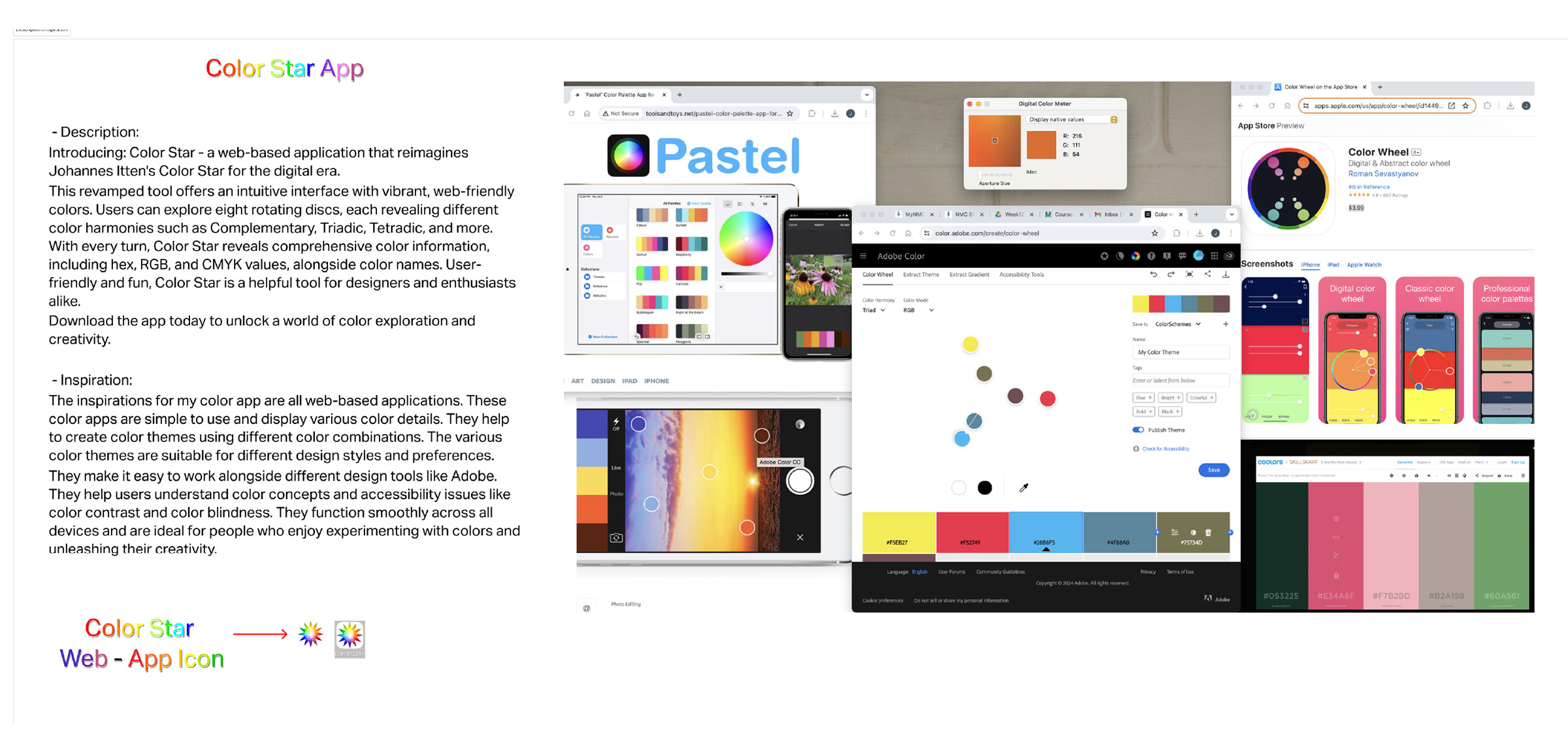
Before I could build it, I had to understand both the object and how the current digital color applications compare.
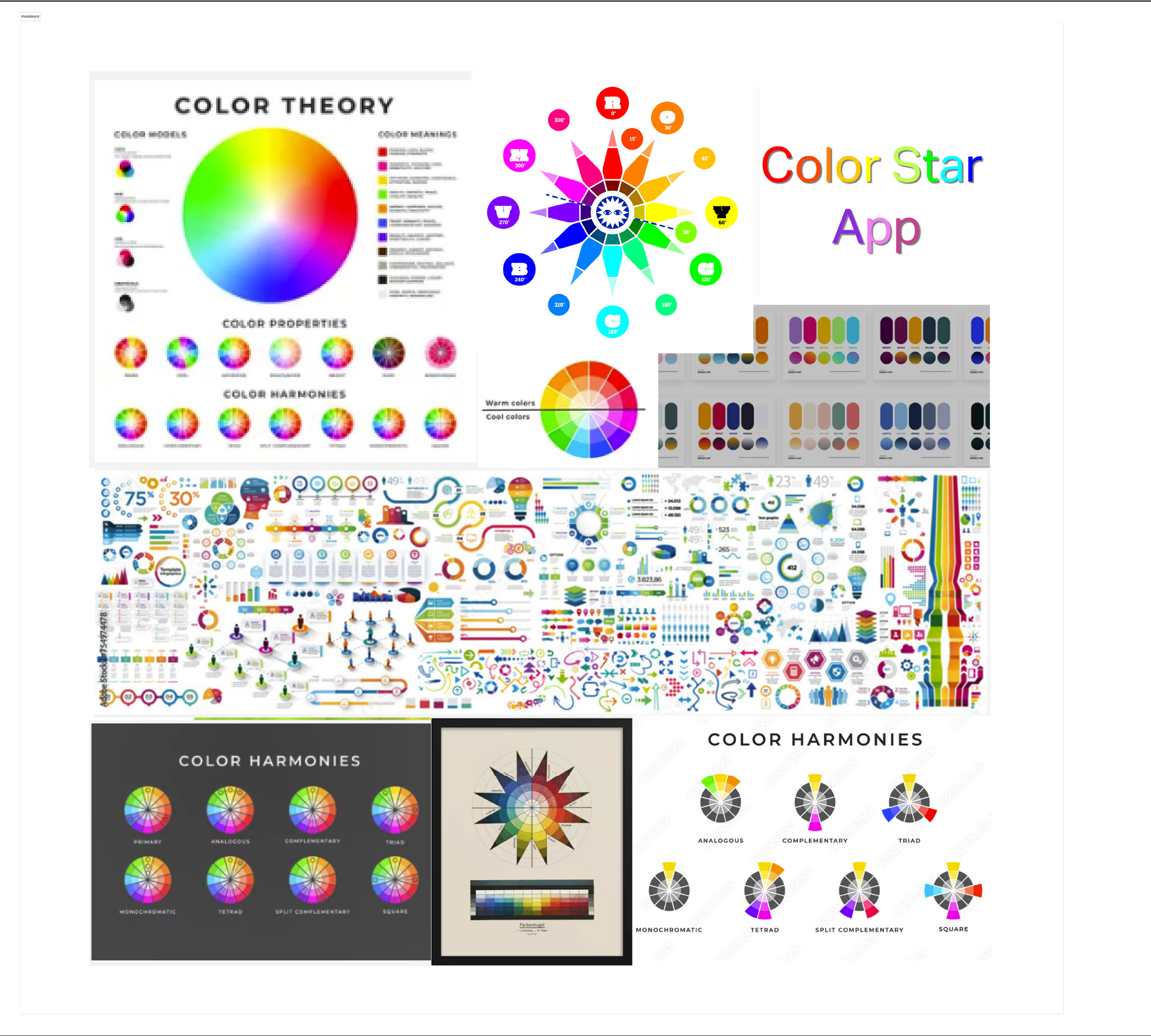
That meant looking at color theory references, existing color apps, and the original Color Star itself.
I needed to understand what made the original useful, what made it distinctive, and how digital color tools usually present color relationships in a more simplified way.

The idea was clear. Rebuilding it accurately was the hard part.
Each disc was scanned individually, rebuilt as vector artwork, and then translated into a system Figma could actually handle.
I used the school’s large-format scanner to capture each disc, then rebuilt them in Illustrator as clean vectors aligned precisely to the color wheel.
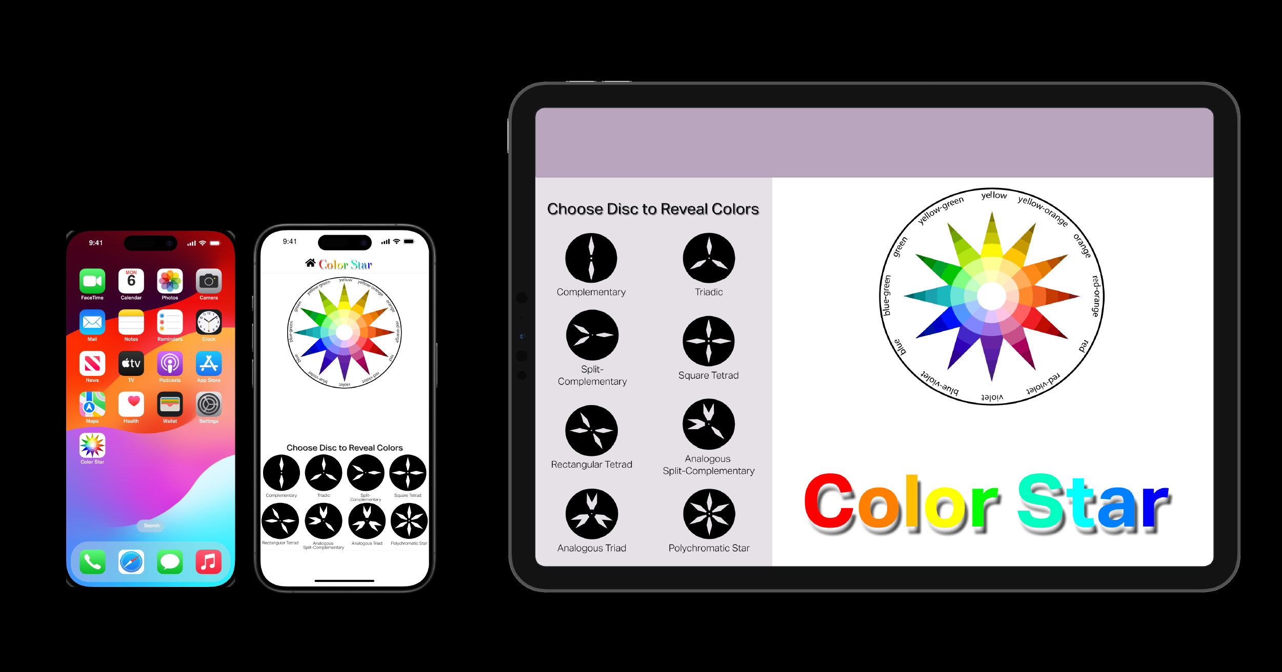
From there, everything moved into Figma. A user needed to be able to choose a harmony disc, rotate it around the wheel, and see the correct color relationships appear at every position. That sounds simple until you start building it.
Each disc had multiple positions. Each position revealed a different harmony. Every one of those states had to be a separate interaction tied to the correct component variant, with the right rotation and the right animation. Multiply that across all the harmony discs and the number of interactions becomes enormous.
It seemed like I would get one interaction working perfectly, and then another one that had previously worked correctly no longer worked. Figma had recently updated its software and was still working through bugs, which added another layer to the troubleshooting. There were stretches where components stopped functioning with no clear reason why.
At one point I went back through both the web and mobile versions and rebuilt them again, making sure every interaction had matching X and Y positions and rotation settings. I even redid the small color labels that changed with each rotation. Even after all of that, a few slight shifts still remain.
I watched tutorials, worked through Figma’s documentation for the current version, and kept testing until both the mobile and web versions finally held together.

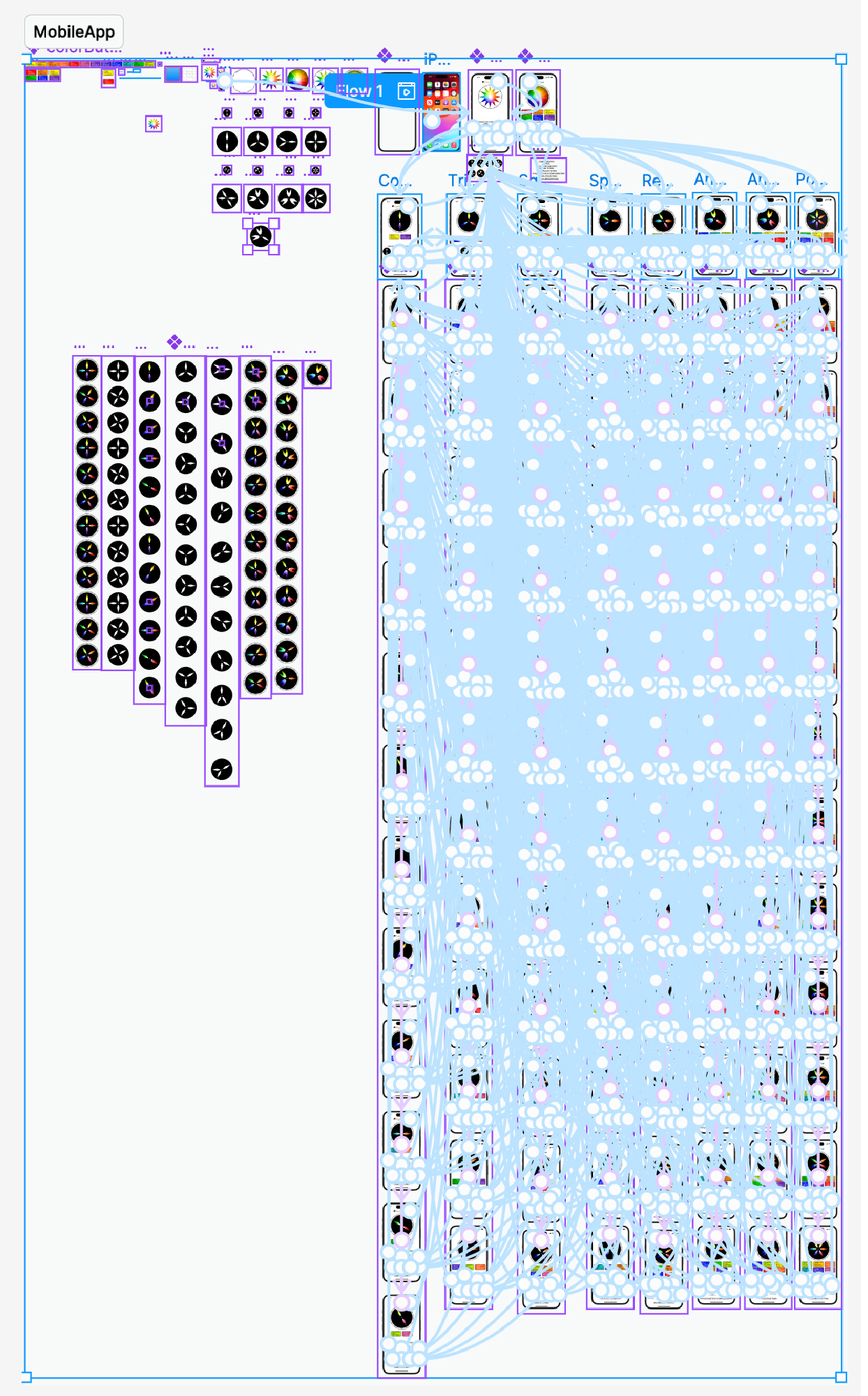
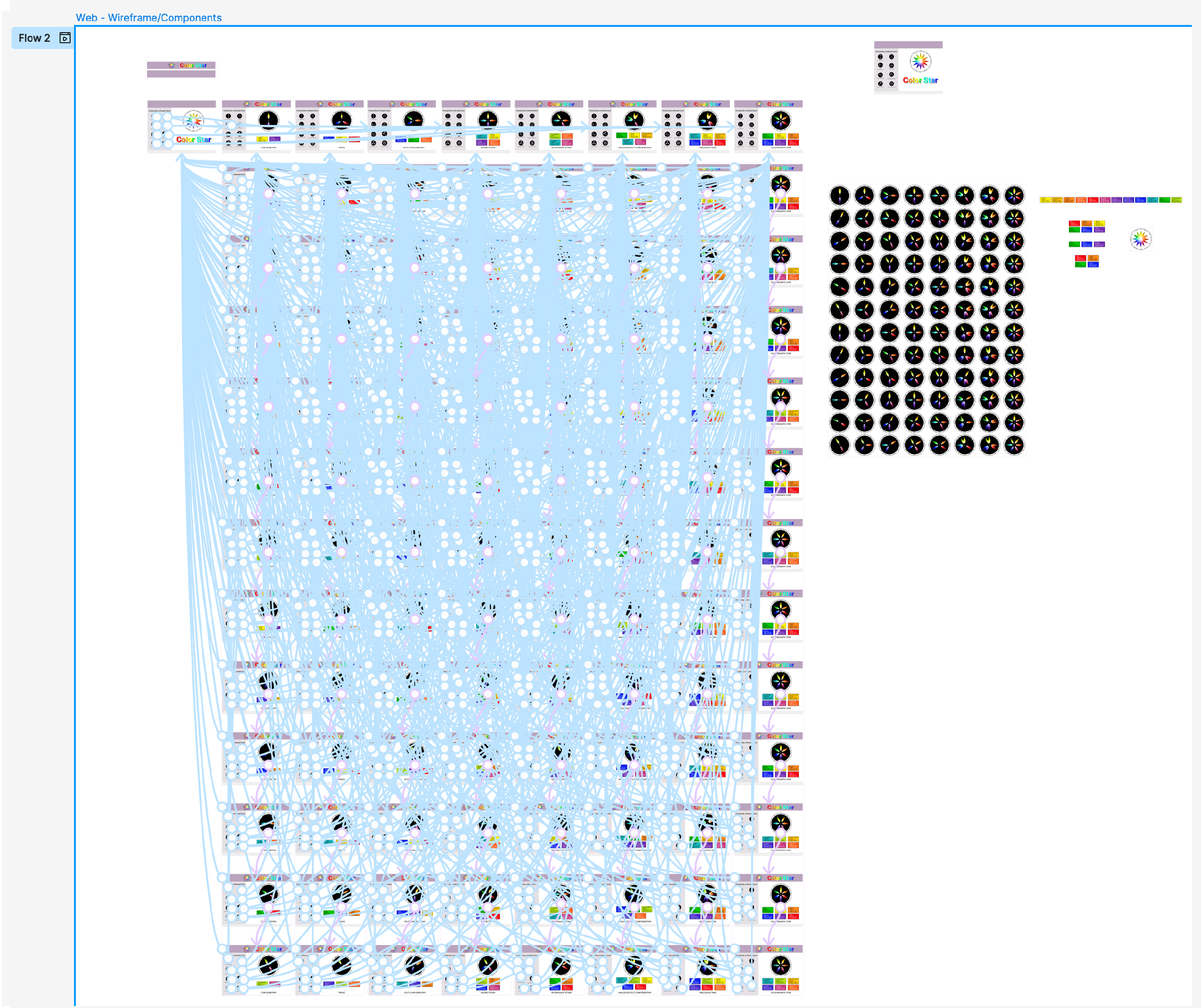
The final result was two working prototypes, one mobile and one web.
Both versions recreate the rotating disc system from Itten’s original book and let the user move through the color harmonies interactively instead of treating them as static diagrams.
There are still a few minor imperfections. On some rotations, a disc shifts slightly on screen by a pixel or two. I went through every state to check alignment, but the cause never became fully clear.
Both prototypes are embedded below, along with demo videos showing the full interaction flow.
You can interact with both versions directly.
The mobile version is designed for portrait use. The web version works best on a larger screen.
To use either version, first select a harmony disc. Then tap or click the disc itself where it sits on top of the color wheel. Each tap or click rotates it to the next position and reveals a different color relationship.