Tea Collection needed an identity that could feel playful and global without becoming generic children’s branding.
This was the first complete brand identity system I built from scratch: logo, color, typography, stationery, mockups, and a full style guide. The assignment asked us to choose an existing company from a provided list and redesign its identity as a professional system.
Tea Collection is a children’s clothing company inspired by global travel and cultural connection. That gave the project a clear challenge: the identity needed to feel warm and imaginative, but also grounded enough to support a real brand with values around sustainability, cultural authenticity, and connection.


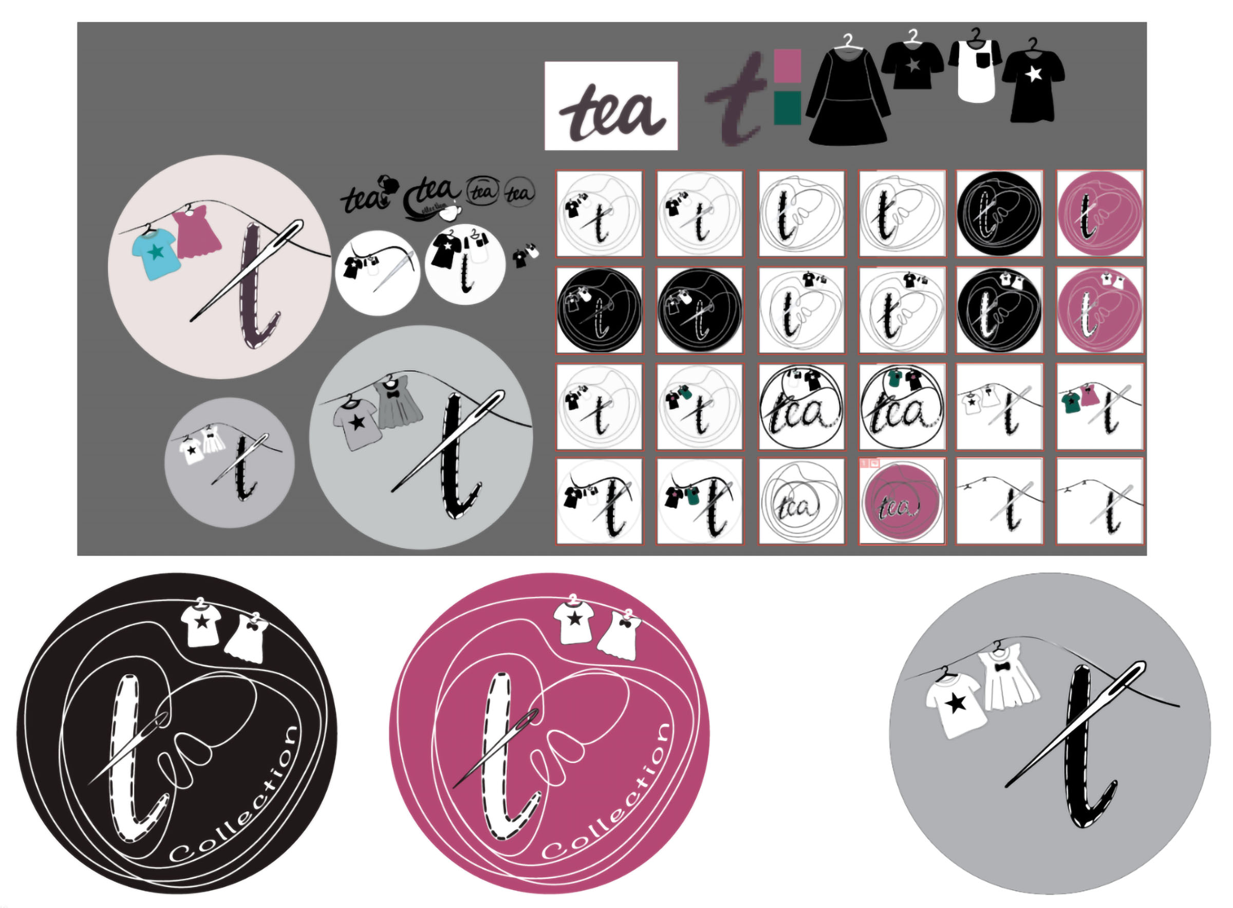
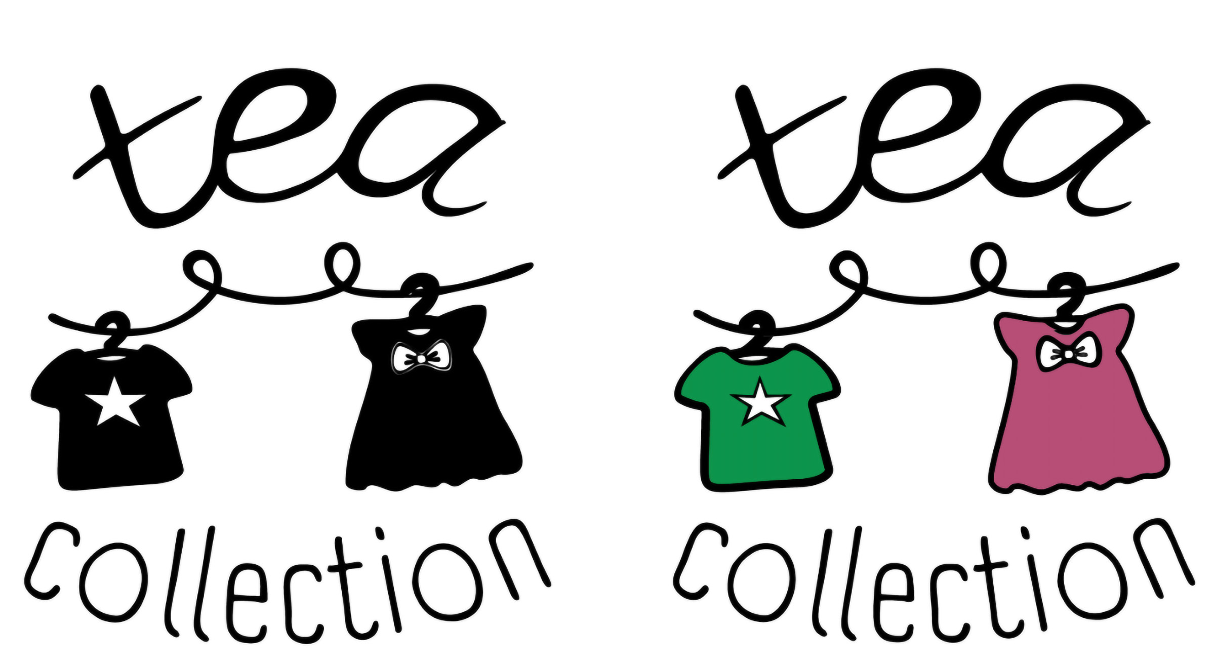
The clothesline became the anchor: simple, human, and directly connected to what the brand makes.
I wanted the mark to feel less like a corporate children’s brand and more like something handmade, warm, and lived-in. The clothesline gave the identity a visual structure that could hold the idea of clothing, travel, care, and childhood at the same time.
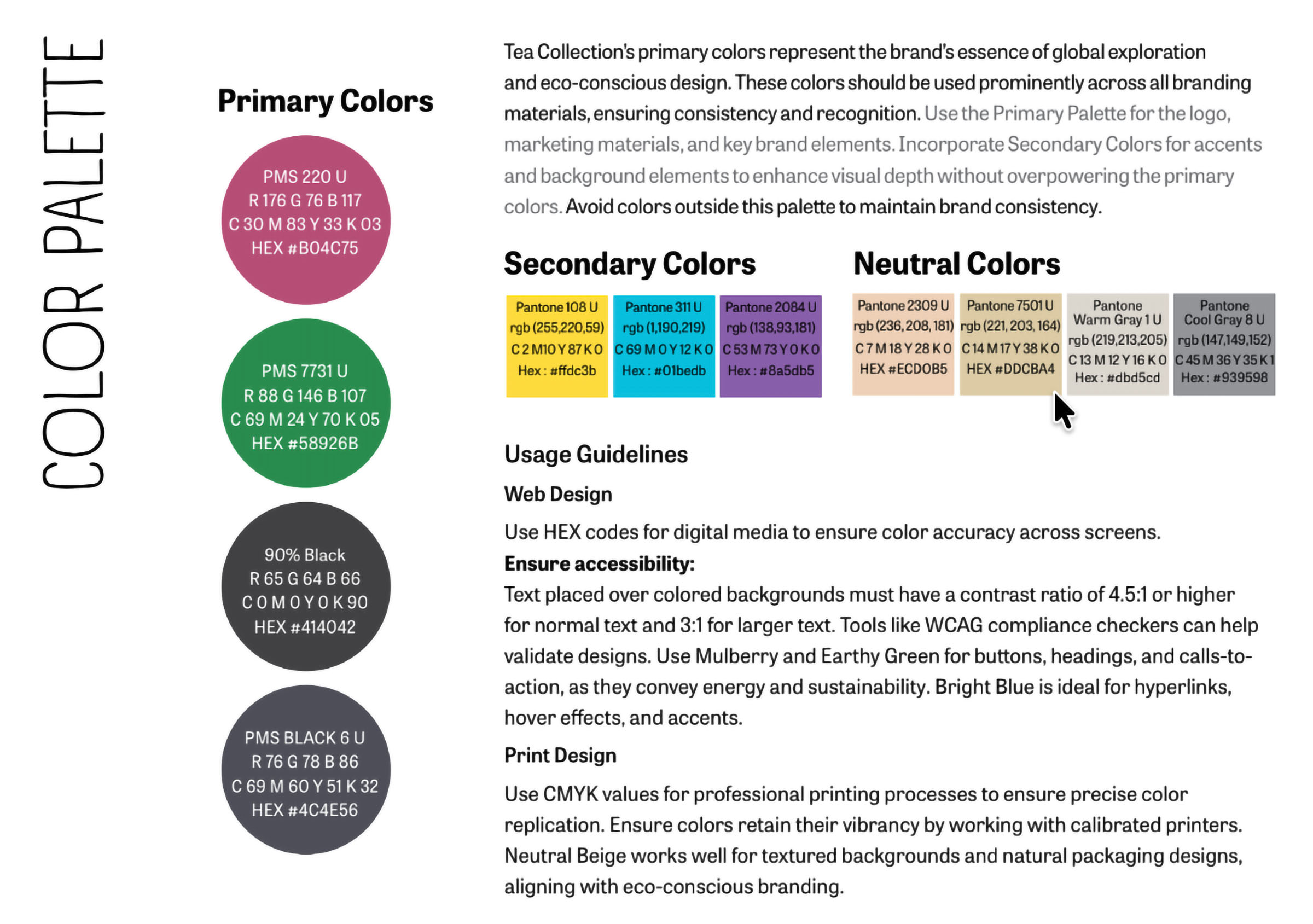
From there, the system started to make sense. Illustrated garments created personality. The hand-drawn wordmark kept the identity from feeling too polished. The color palette balanced warmth and sustainability, with a mulberry tone for playfulness and an earthy green to ground the system.

The concept had to come before the aesthetics.
I started with research and moodboards before moving into logo sketches, color, type, and system rules.
The words that kept coming back were travel, connection, sustainability, playfulness, and cultural authenticity. Once the clothesline idea was clear, the rest of the identity had something to respond to.
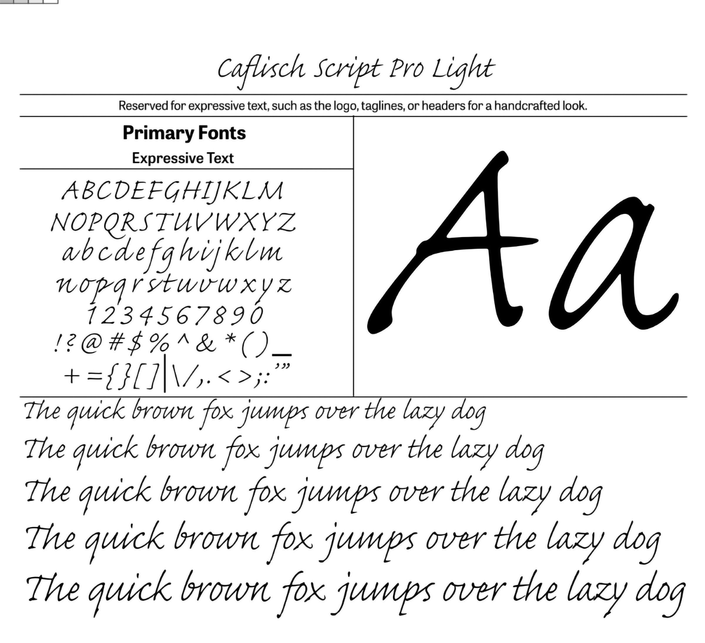
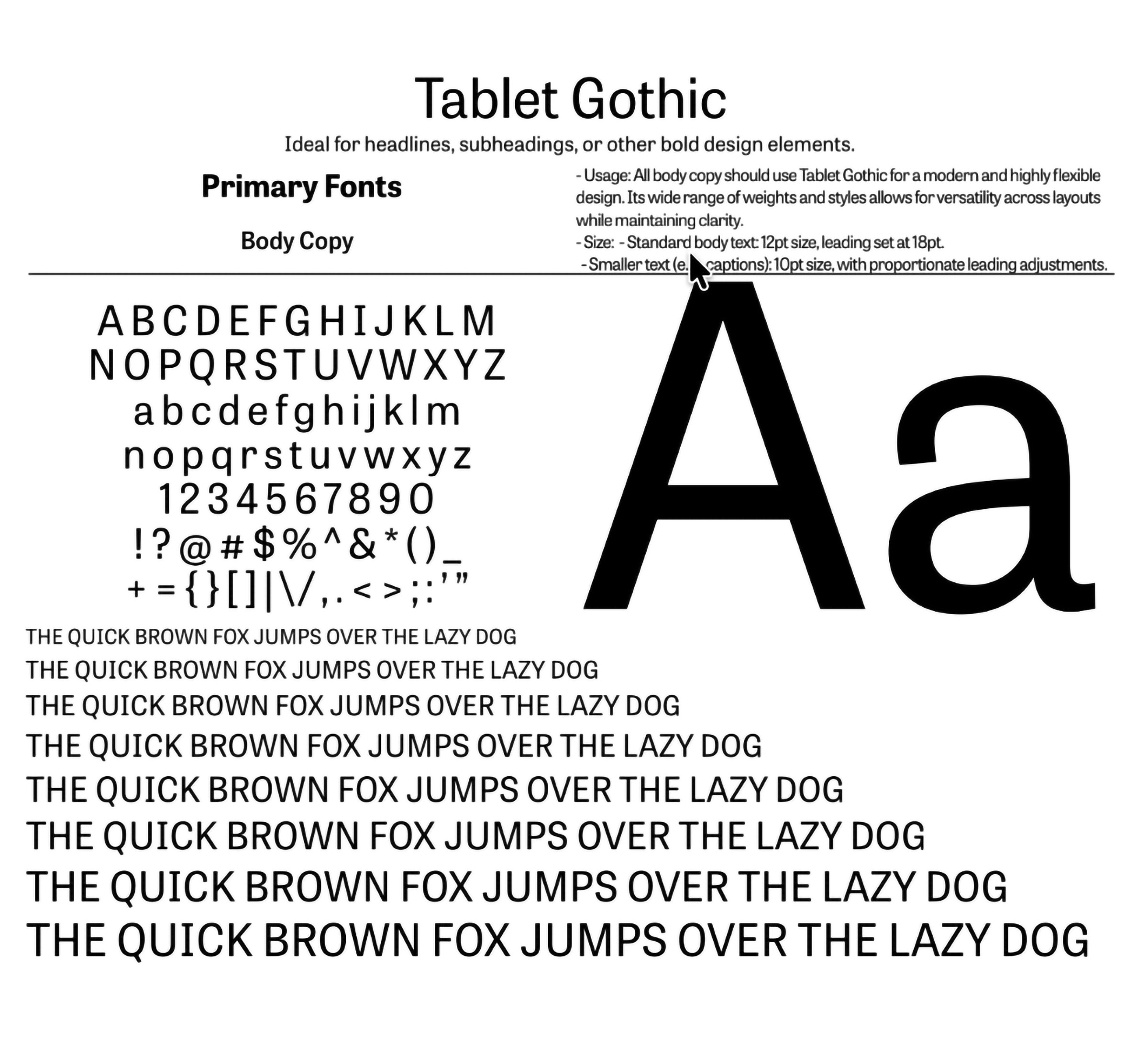
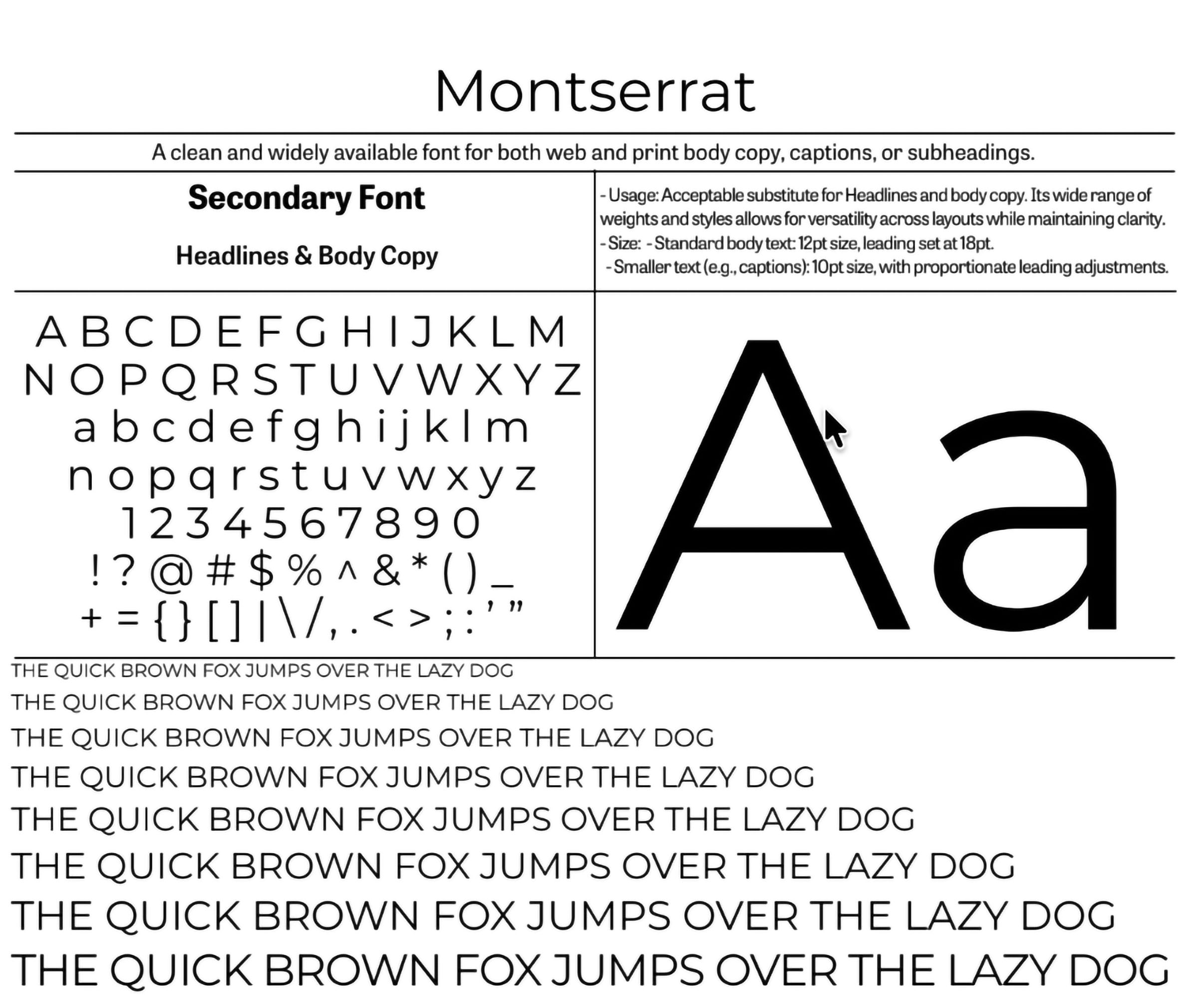
The final type system paired Caflisch Script for expressive headers, A Day Without Sun for bold all-caps moments, and Tablet Gothic for body copy. Each choice had a role, so the system could feel playful without becoming chaotic.
A type system with different kinds of warmth.
The typography needed to support both personality and clarity.
Caflisch Script carried the handmade quality of the identity. A Day Without Sun added boldness and play. Tablet Gothic kept the system readable and stable in body copy and practical brand materials.

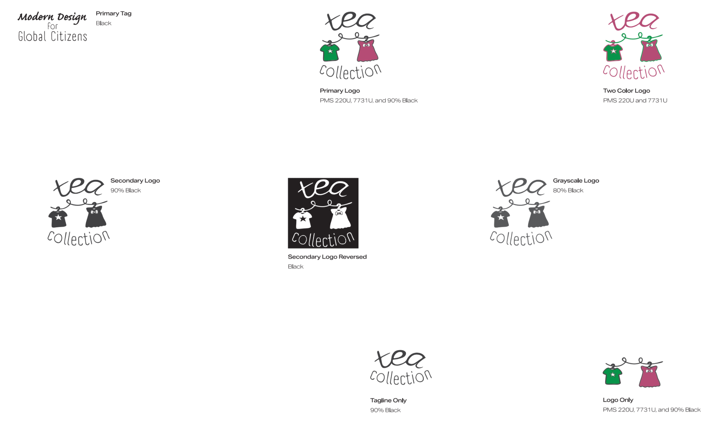
A complete identity system, documented for handoff.
The final deliverable was not just a logo. It was a brand system with rules, applications, and enough structure for someone else to use it consistently.
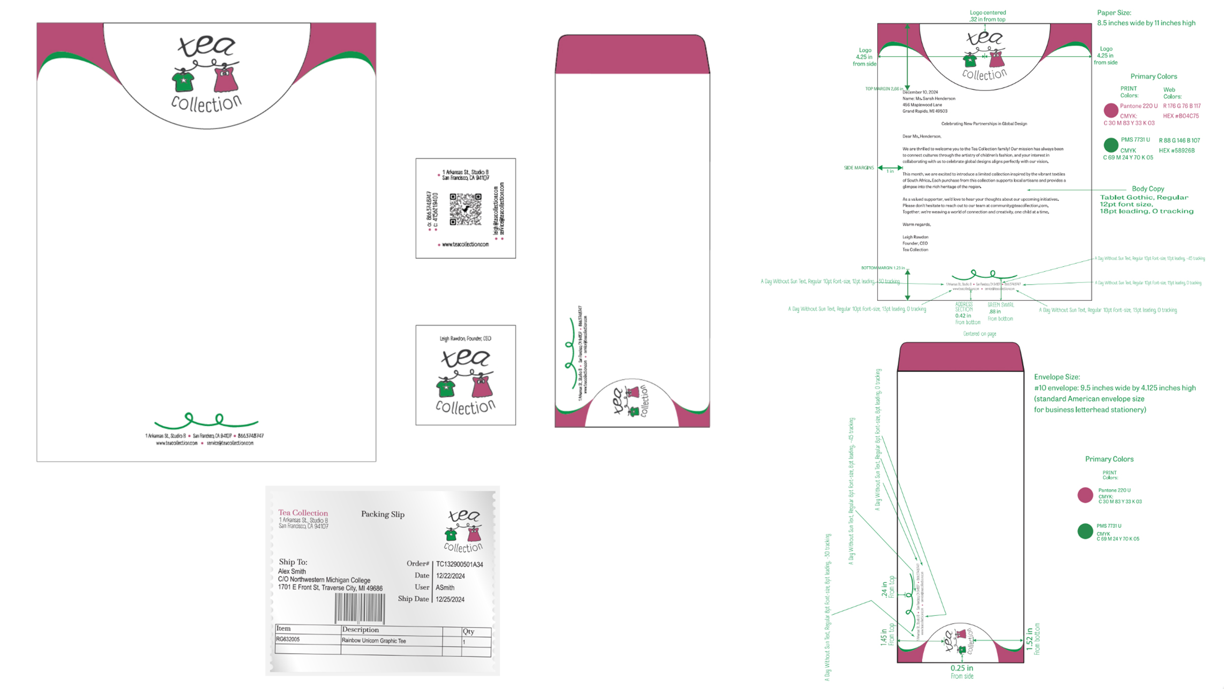
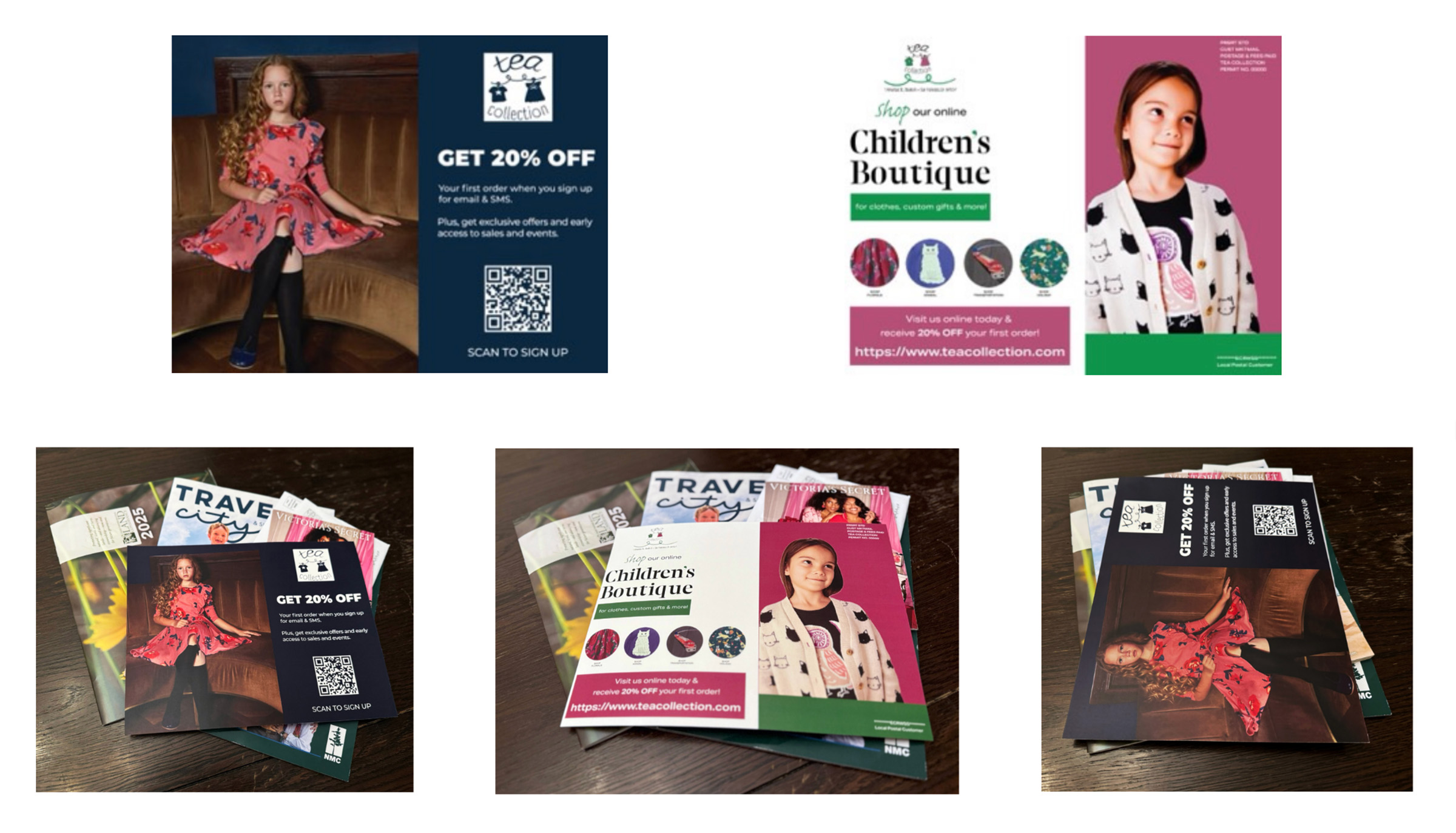
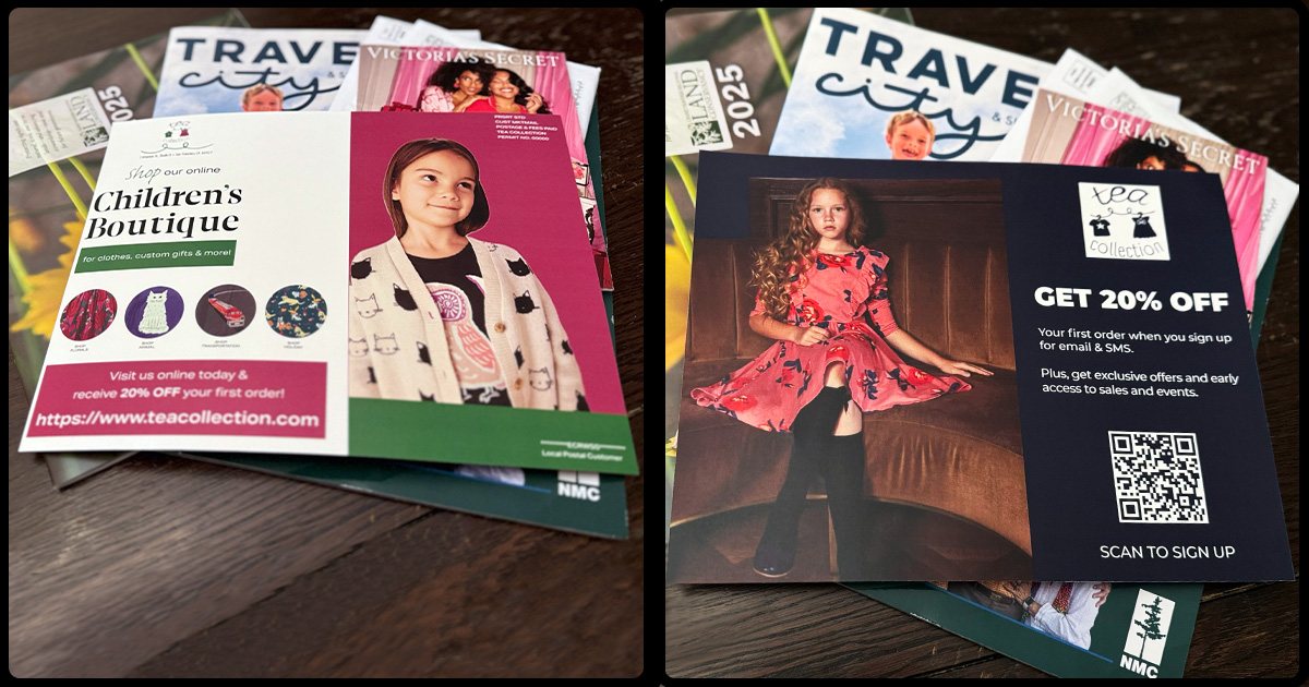
The finished style guide documented the logo system, color formulas, typography, stationery specifications, and applied examples. It included Pantone, CMYK, RGB, and HEX values, along with sizing, spacing, and usage guidance.
This project changed how I understood identity design. The strongest part was not any single visual choice. It was learning how each decision needs to support the same idea, or the system starts to drift.